
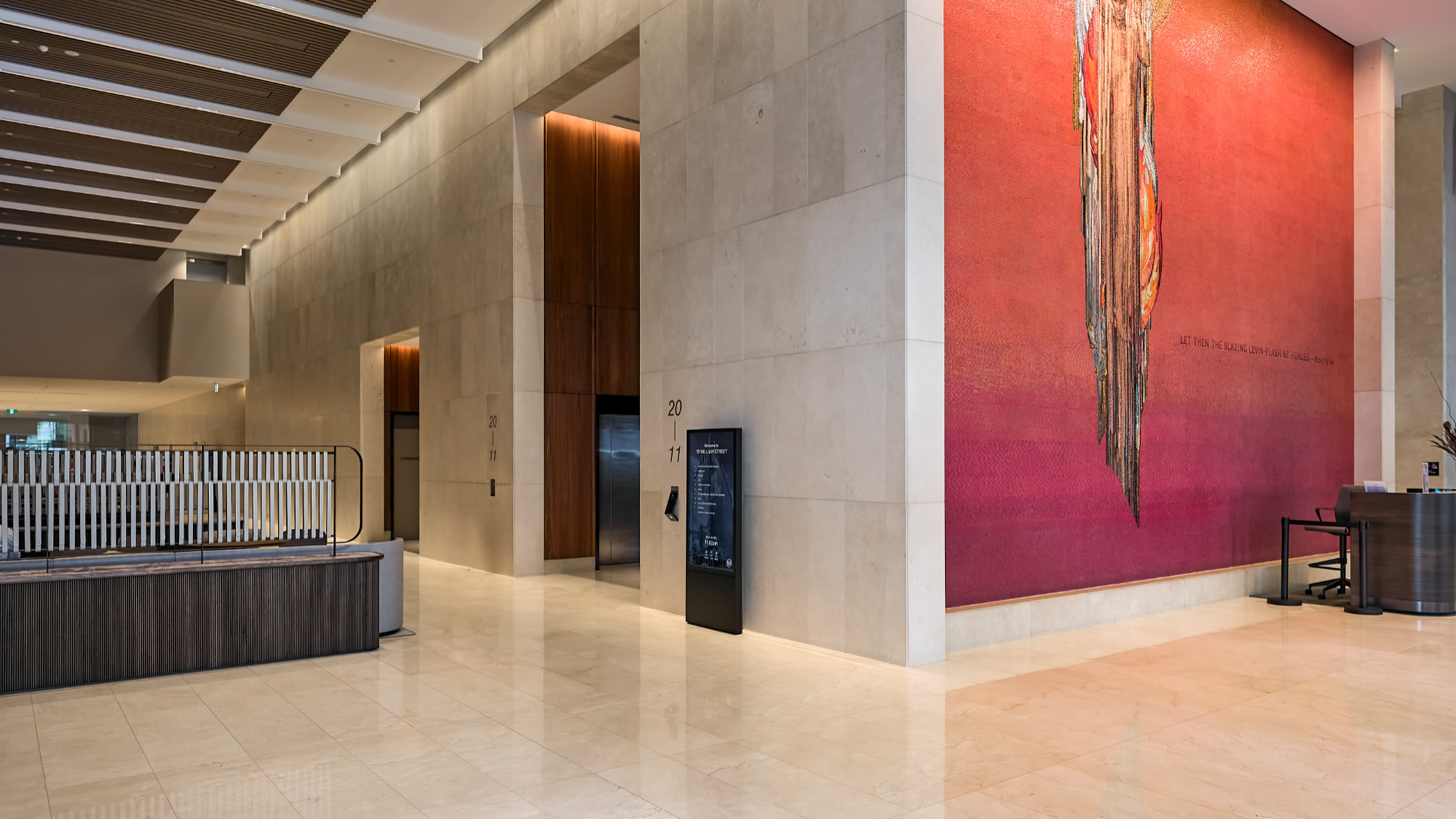
A tenant directory is often the first thing a visitor looks for when they enter a building. It needs to tell them where to go, but it can also do something more: make them feel they have arrived somewhere considered and well designed.
We think a directory should belong in the building, not look like something added later.
That starts with the architecture. Is the building modern, corporate, classical or heritage? Should the directory blend quietly into the space, or be more of a statement piece that commands attention?
There is no single right answer. In some foyers, the best result is clean, restrained and almost invisible. In others, the directory can become a strong visual feature and an obvious point for visitors to head towards.
Location matters
Too often, directory locations are chosen because there happens to be a convenient piece of empty wall.
That may be easy, but it is not always the best solution.
The directory is a key discovery point for visitors, so it should sit where people naturally look when they enter. In some buildings that may be beside the lifts. In a narrow walkway, it may need to sit neatly against a wall. In a large foyer, a floor-mounted directory can act as a beacon.
Sometimes moving furniture, signage or another fixture will create a much better position. A little extra effort during installation can produce a better result for years to come.
How big should it be?
Our general rule is simple: choose the largest size that comfortably suits the space and budget without overpowering the building.
A smaller directory may work perfectly in a narrow lobby where visitors stand close to it. In a large foyer, a larger display makes more sense, particularly where multiple visitors may need to view it at once.
Size matters, but not at the expense of visual cohesion.
Wall or floor mounted?
Wall-mounted directories are usually the simplest and most economical option where the right wall is available.
Floor-mounted systems cost more, but they solve the wall-space problem and can have much greater visual impact. In a large foyer they can become an obvious destination rather than something visitors have to search for.
Again, the building should guide the decision.
Portrait or landscape?
This is generally an aesthetic choice rather than a technical one.
Both orientations can display the same tenant information. A tall narrow space may naturally suit portrait, while a wide architectural feature may work better in landscape.
We let the physical environment guide the choice rather than forcing the building to suit the directory.
Why non-touch?
Sprocket GO directories are non-touch by design.
The aim is to let visitors find the tenant they need quickly, while allowing multiple visitors to view the directory at the same time. Interactive systems can be useful in some environments, but they also tend to turn the directory into a one-person-at-a-time experience.
Where additional orientation is useful, a static floor or location map can be incorporated into the display.
Who keeps it up to date?
A beautifully designed directory is of little value if the information is wrong.
Tenants change, staff change and updates get forgotten. This is why a fully managed service makes sense.
Think of the directory as a 24/7 concierge. If that is the job it is doing, someone needs to make sure it stays current, operational and looking right.
Start with the building
The best directory is not necessarily the biggest, most expensive or most technically advanced.
It is the one that suits the building, sits in the right place, can be seen easily and gives visitors the information they need without making them work for it.
At Sprocket, that is where we start. We look at the foyer, the architecture, the available space and how visitors move through the building before recommending a solution.
Because a good directory should not simply be in the building.
It should feel like it belongs there.